 Login
Login Sign Up
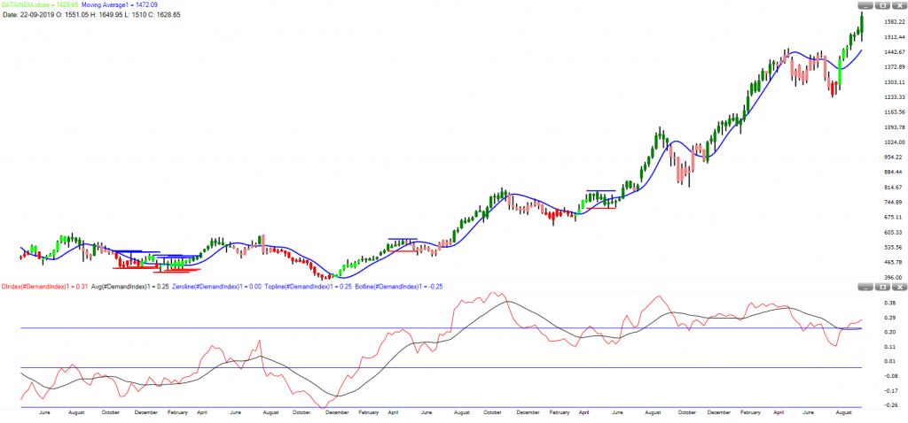
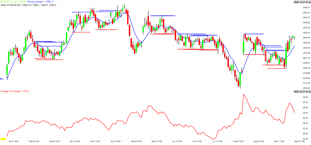
#Investment-Market Phase
It is very helpful for investors and positional traders.
Green color candle represents prices are in a strong uptrend while Red color candle represents prices are in a strong downtrend.
Light Green color candle represents prices are in a process of base building (accumulation) and a breakout is near while Light Red color candle represents prices are in a process of distribution and a breakdown is near.
Horizontal Blue and Red line identifies trading range. Use this range when prices are either in a strong uptrend or strong downtrend. Follow breakouts which are in the direction of the trend.
Moving average on the chart is for the confirmation of the trend.
On the lower panel, Demand index indicator represents supply and demand for the stock. If indicator line crossed above signal line and moving up, it means demand is increasing while if indicator line crossed below signal line and moving down, it means supply is increasing.
#Investment-Momentum
It is very helpful for investors and positional traders.
Green color candle represents prices are in an uptrend while Red color candle represents prices are in a downtrend.
Arrow on the chart is for first confirmation of the direction. A green arrow suggests a likely uptrend while a red arrow suggests a likely downtrend.
Moving averages on the chart are for second confirmation. If Red MA crosses below Green MA then trend is down while if Red MA crosses above Green MA then trend is up.
Blue lines on the chart are for support and resistance. In an uptrend, the resistance should break on upside while in a downtrend the support should break on a downside.
If prices are trading sideways then these support and resistance line should hold and prices should reverse from there.
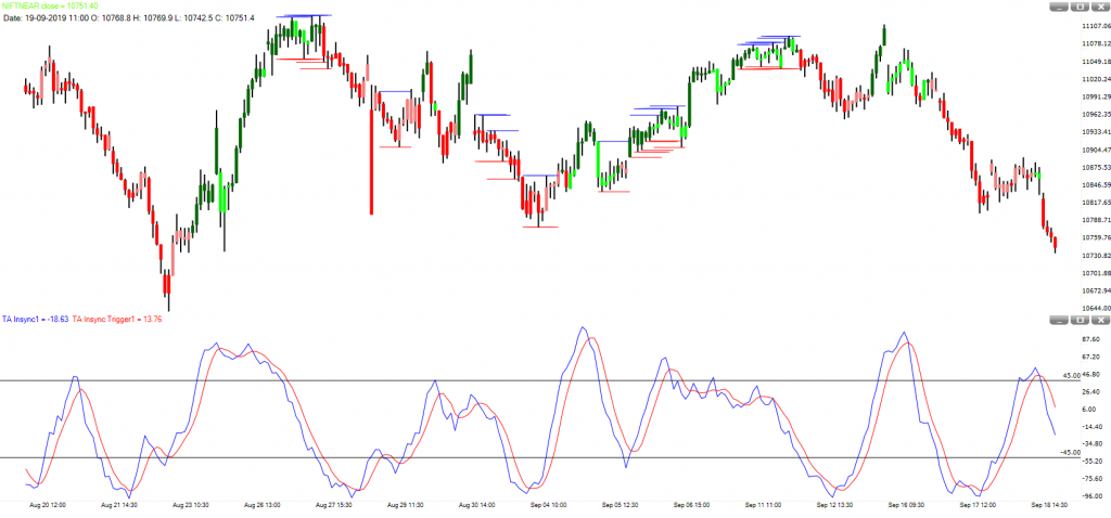
#Swing Trades-Reversals
It is very helpful for Swing traders who hold position for 1 to 3 days.
Green color candle represents prices are in a strong uptrend while Red color candle represents prices are in a strong downtrend.
Light Green color candle represents prices are in a weak uptrend while Light Red color candle represents prices are in a weak downtrend.
On the lower panel, TA Insync indicator gives early warning of a reversal. If indicator line crossed above signal line and moving up, it means an up move is likely to begun while if indicator line crossed below signal line and moving down, it means a down move is likely to begun.
Horizontal Blue and Red line identifies trading range. Follow breakouts which are in the direction of the trend.
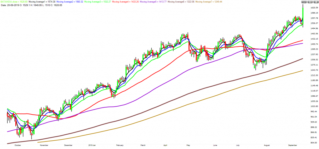
#Moving Average Roadmap – Direction
It is very helpful for making directional view on prices.
5 days EMA – BLACK – Strong Momentum
10 days EMA – BLUE – Short Term Trend
20 days EMA – GREEN – Pullback Support/Resistance
50 days SMA – RED – Uptrend/Downtrend Defence Line
100 days SMA – VIOLET – Big Price Dip/Rally
200 days SMA – BROWN – Bull’s Last Stand in an uptrend, bears last stand in a downtrend
250 days SMA – GOLDEN – Value zone
#Intraday-MA Reversal
It is very helpful for intraday traders.
Green color Histogram represents prices are in a strong uptrend while Red color Histogram represents prices are in a strong downtrend.
Line on the Histogram represents the direction of prices.
When line on the Histogram turns up and histogram bars are red then if will give first warning of a likely up move. Confirmation comes when Histogram turns from Red to Green.
When line on the Histogram turns down and histogram bars are green then if will give first warning of a likely down move. Confirmation comes when Histogram turns from Green to Red.
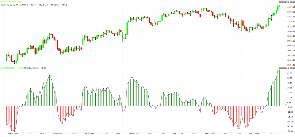
#Trend-MA2MADIFF
It is a trend trading style and very helpful for all type of trader.
Red color line on the chart is 50 period SMA while Black color line on the chart is 200 period SMA.
Long trade is justified when Prices are above Black Line and Histogram color is green.
Short trade is justified when Prices are below Black Line and Histogram color is red.
Buy when Price closes above Red Line.
Sell when Price closes below Red Line.
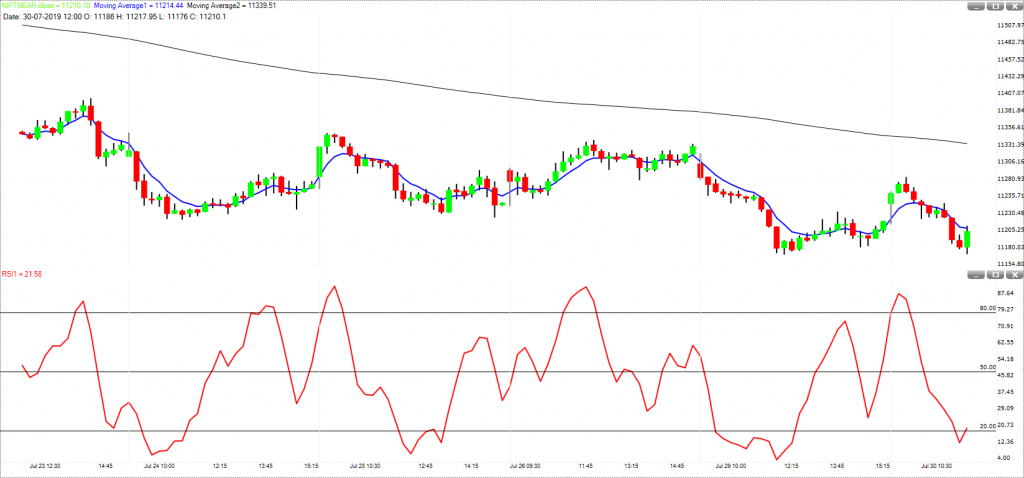
#Momenum-2EMA-RSI
It is a momentum trading style and very helpful for all type of trader.
Blue color line on the chart is 6 period EMA while Black color line on the chart is 200 period EMA.
On the lower panel, we have applied RSI indicator with input 3 (smooth by 3). Overbought zone is above 80 and oversold zone is below 20.
Long trade is justified when Prices are above Black Line and short trade is justified when Prices are below Black Line.
Buy when RSI breaks above oversold zone or 6 Period EMA (Blue line) turns up.
Sell when RSI breaks below overbought zone or 6 Period EMA (Blue line) turns down.
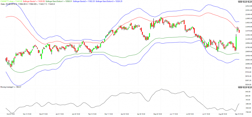
#Reversal-2BB-DeTOsc
It is a momentum trading style and very helpful for short term traders.
We have two Bollinger Bands. Period is same but Standard Deviation value is different.
Blue color lines on the chart will serve a purpose of stop loss.
On the lower panel, we have applied Moving Average of De Trended Price Oscillator.
Long trade is justified when oscillator line is moving up and short trade is justified when oscillator line is moving down.
Buy when price touch the green line and closed higher.
Sell when price touch the red line and closed lower.
This strategy work well when prices are not in a strong trend.
A close above the Red Line or a close below the green line signifies a strong trend.
#Breakout-Trend Direction
It is a breakout trading style and very helpful for intraday, short term and positional traders. Investors can also use this trading style but they have to apply it on weekly chart.
Horizontal line Blue and Red on chart identifies support and resistance for a breakout.
Moving Average on chart confirm the direction of the breakout.
ATR on lower panel suggests if this breakout is genuine or not.
Buy when price breaks Horizontal Blue Line and sell when price breaks horizontal red line.
MA line should be moving in the direction of breakout. MA should be up if prices breaks above and MA should be down if prices breaks below.
On the breakout bar for both sides, the ATR should see a rise from previous value.
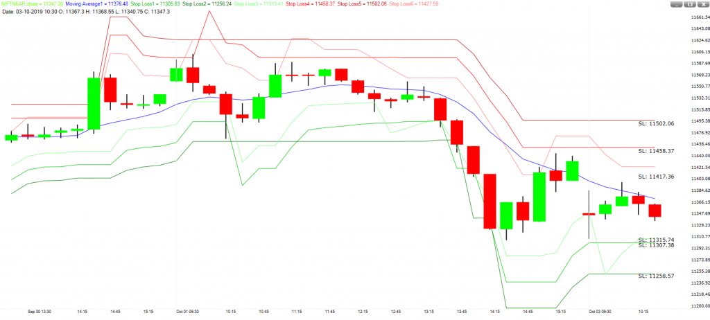
#Trend-SL-TG-Short Term
It is a trend trading style and very helpful for intraday, short term and positional traders.
Blue line on the chart is moving average line.
Buy when Blue line is moving up and sell when the Blue line is moving down.
If you are long then the three red lines above the prices will be act as multiple targets. For example if you expect a large move then use farthest line as a target and if you expect a normal movement the use the middle line.
Similarly, in case of stop loss, three green lines below the prices will act as multiple stops. If you want to risk less then use the nearest line and if you’re willing to risk more then use the farthest line.
If you are short then the three green lines below the prices will be act as multiple targets. For example if you expect a large move then use farthest line as a target and if you expect a normal movement the use the middle line.
Similarly, in case of stop loss, three red lines above the prices will act as multiple stops. If you want to risk less then use the nearest line and if you’re willing to risk more then use the farthest line.
Red & Green lines above and below the prices are trailing in nature. So if you want to stay in a trade as long as trend persists then do not use them for targets. Use them only for stop losses.
1 thought on “Templates”